Carlos Romo-Melgar
→ Works
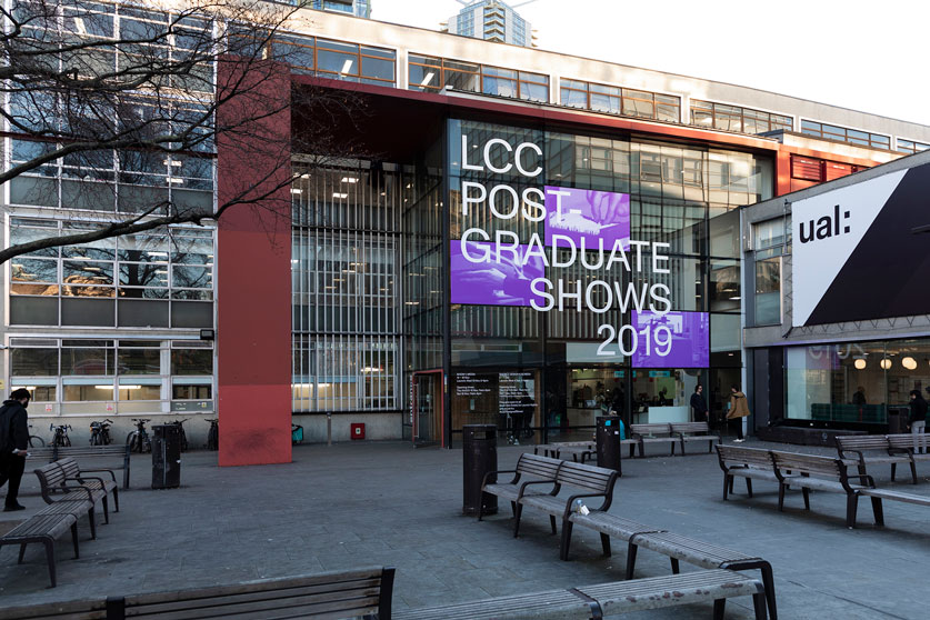
→ → LCC Postgraduate Shows
CLIENT: London College of Communication / UAL
ROLE: Graphic Designer in collaboration with John Philip Sage
LOCATION: London
DATE: 2019
The design of the 2019 LCC PG shows is focused on the idea of archiving and exporting the work done by a very diverse community of students. This work, with a strong research component, is encapsulated and afterwards pushed into other arenas, outside the university, and the country.
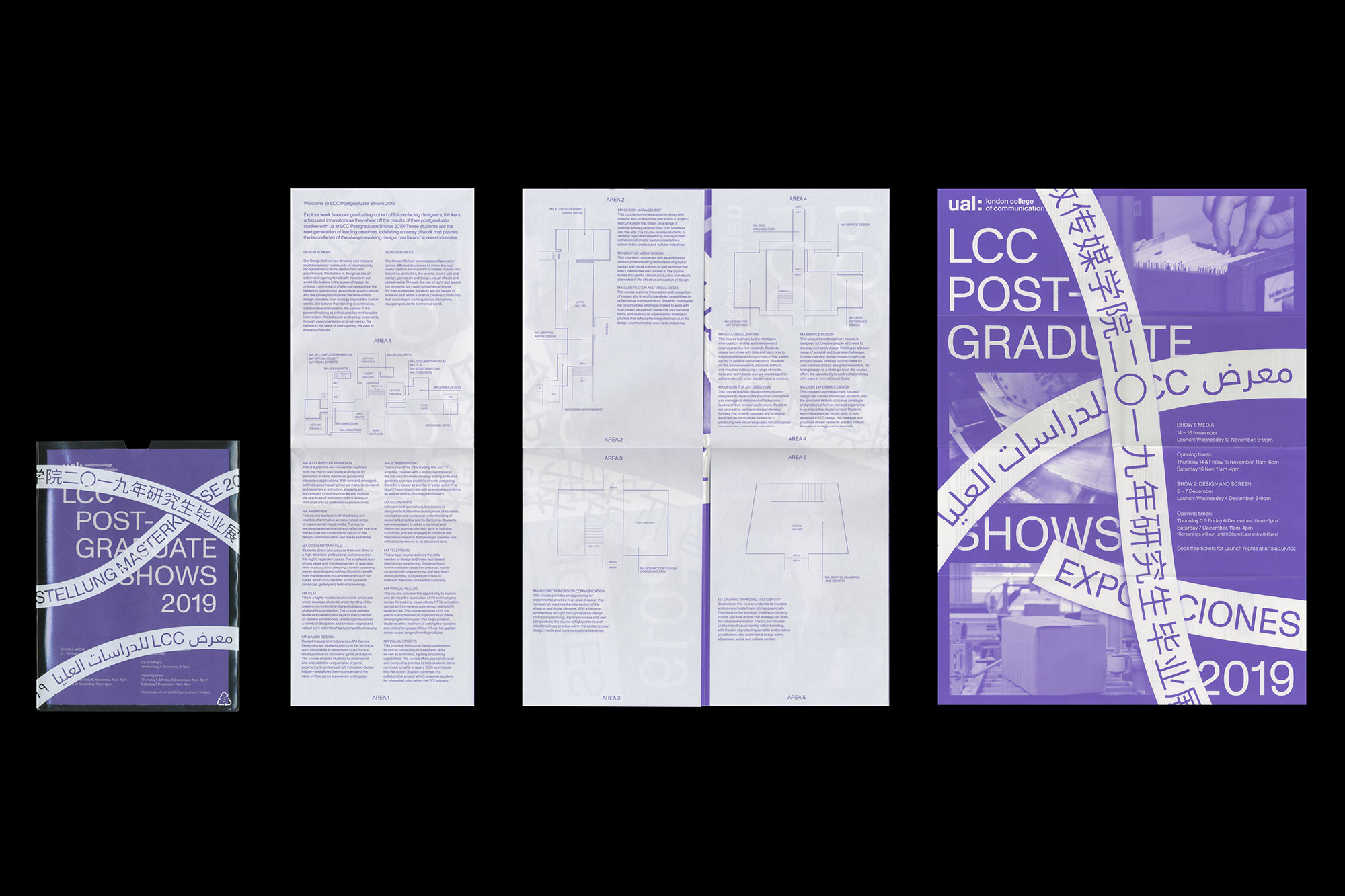
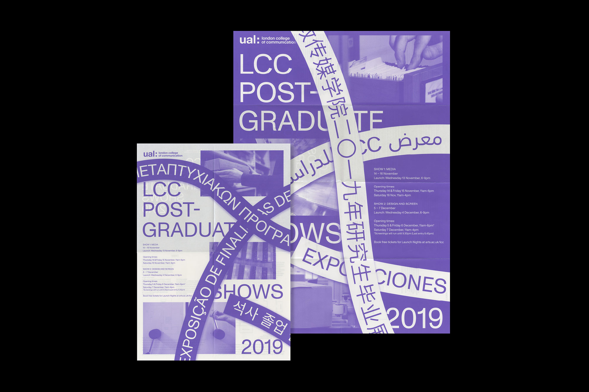
All the imagery in use represents finishing stages and packaging processes. With the aim of creating entry points to the exhibited work to friends, family and industries outside of the UK, the main information of the shows was translated to the 20 most used languages by the LCC postgraduate community.

VISUAL IDENTITY
The overall identity is a continuation of that from the Degree Shows, highlighting main differences in the type of show and its intentions.
The journey of a postgraduate student involves resignifying a previous knowledge, relocating it in new arenas, and expand their networks. The exhibition of these works and the dissemination in the professional sphere brought with it a visual language of logistics, archiving, and packaging. We decided to use videos to emphasise the in-action component of the shows, and to highlight disciplines taught at LCC which usually are less explored in the visual identity of the shows.
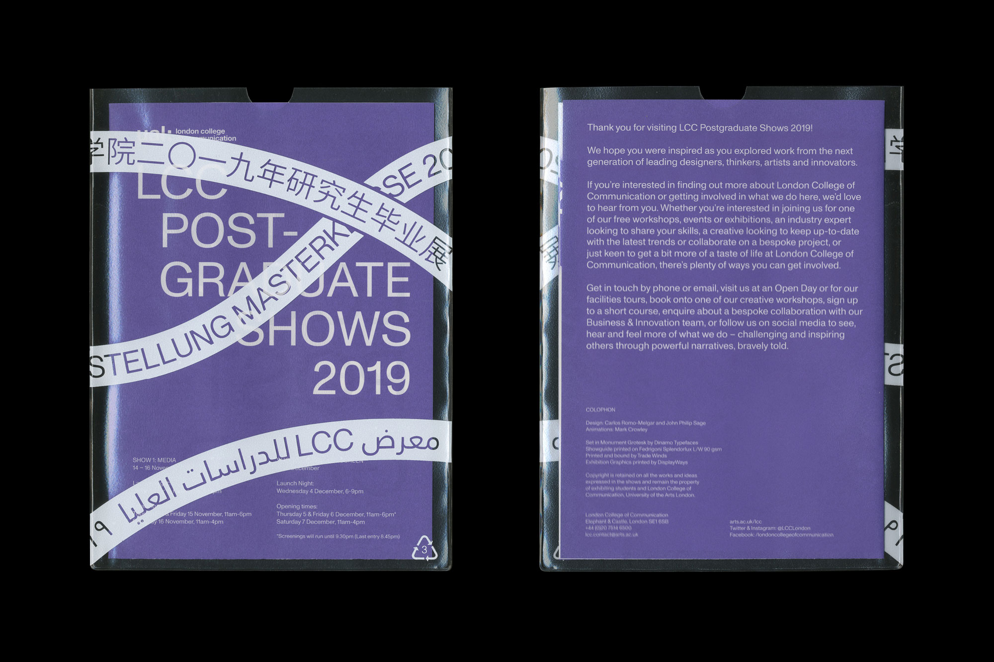
The postgraduate community is also diverse in backgrounds, countries and languages. We saw these shows as an event that will be seen not only from London, but also in other countries. Students will bring the memory and record of this event to their home countries. For this reason, the use of 32 languages for the design of this identity was key. They operate at the same hierarchy level as English, aiming to represent in visual terms this diversity.
SIGNAGE SYSTEM
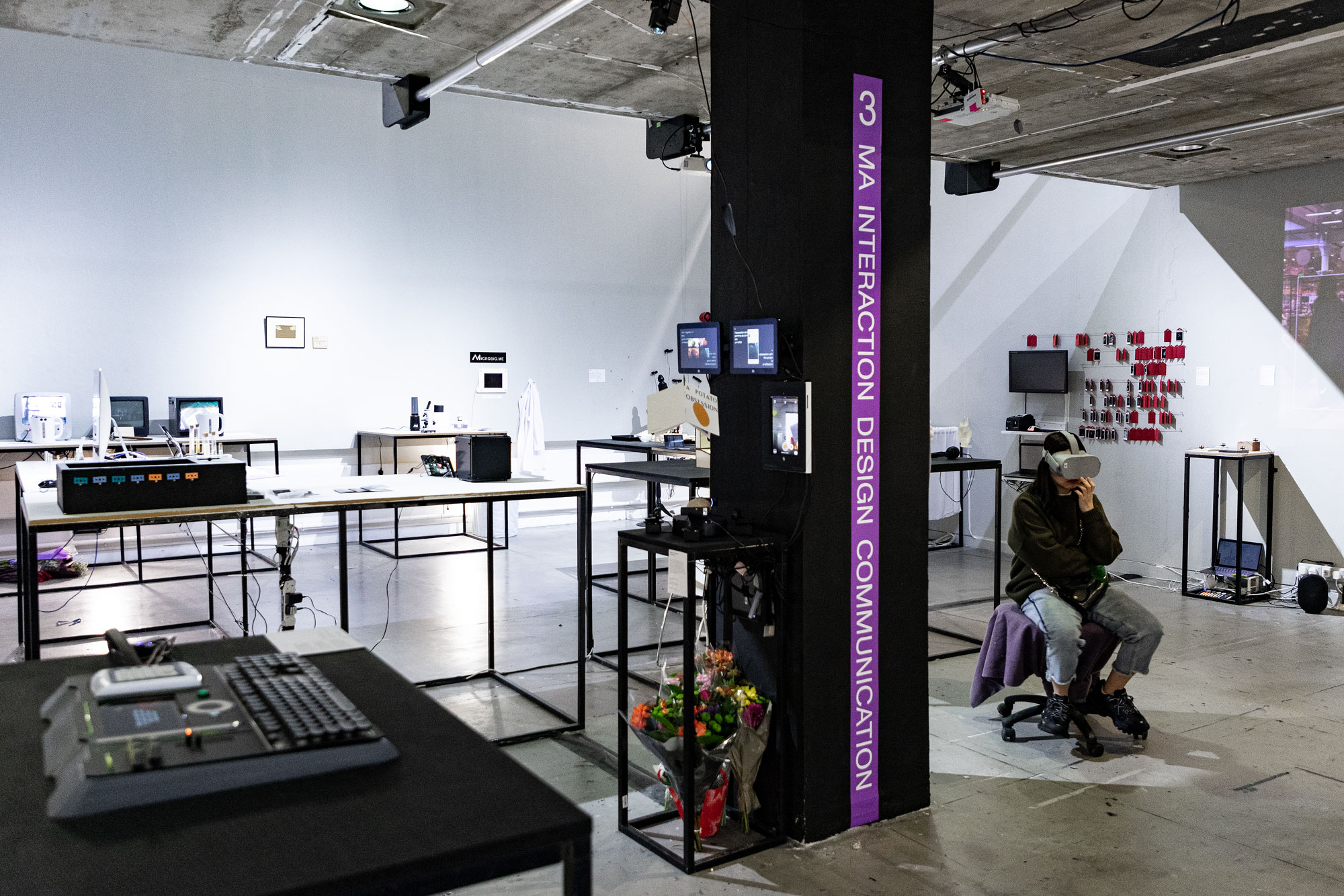
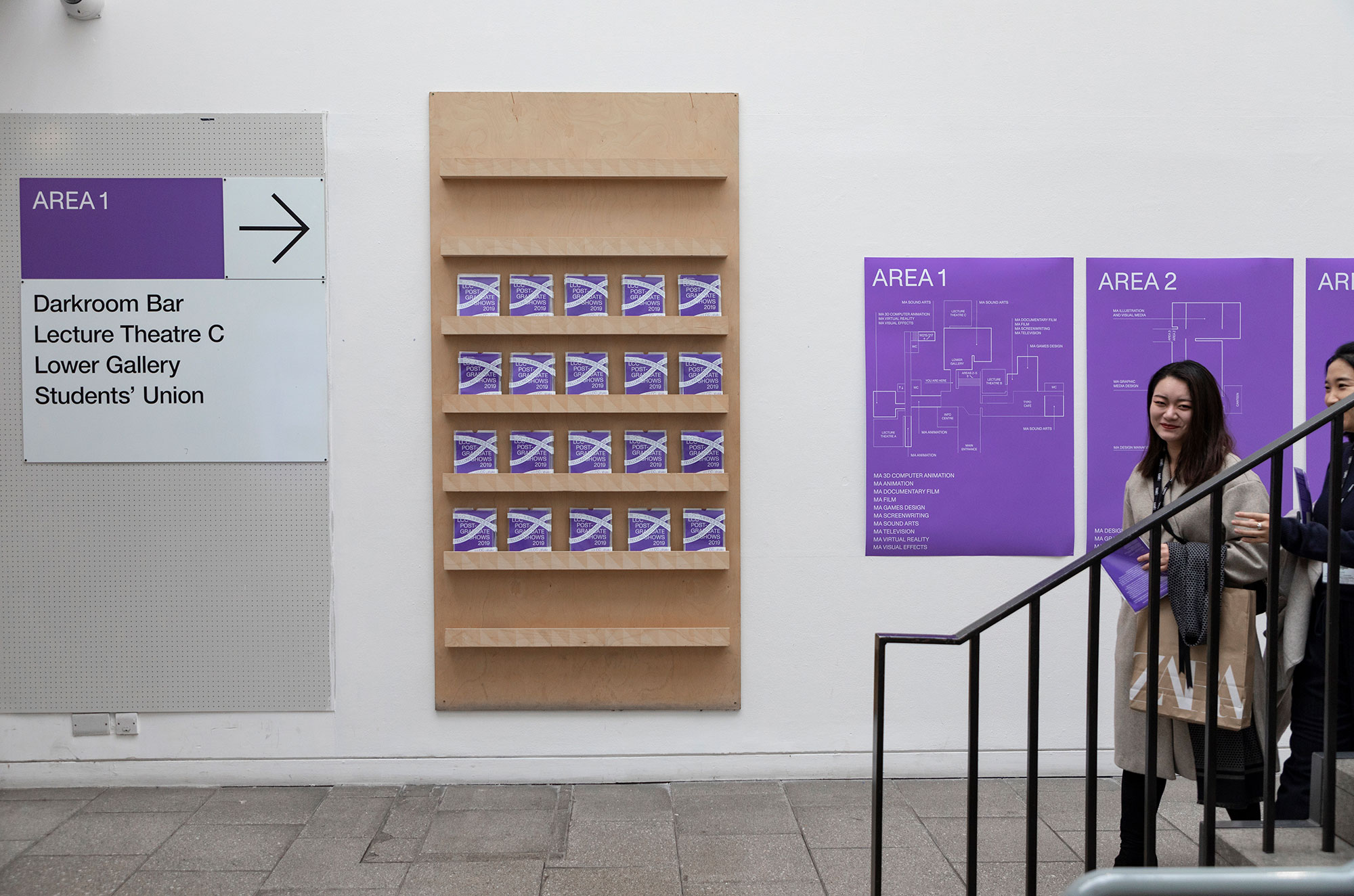
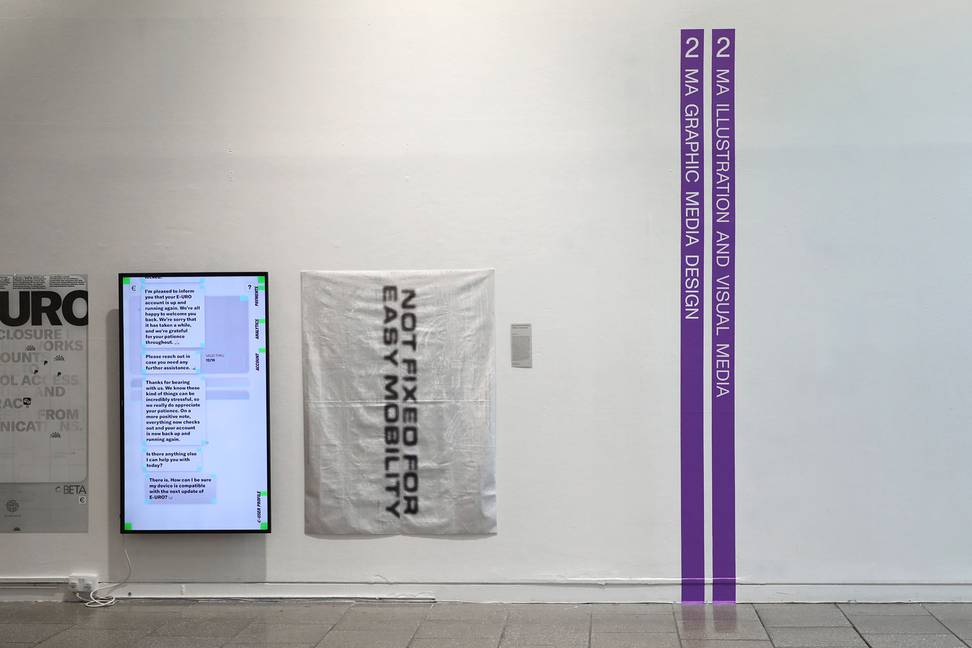
The Postgraduate shows include works from more than 15 courses, offering a diverse range of visual languages. For this reason, the way the identity is applied to the course signage and wayfinding is punctual and minimal, only highlighted by the use of the main exhibition colour.
The signs serve as visual indicators of the navigation around the building, as they can be seen from a long distance.
SHOWGUIDE POSTERS
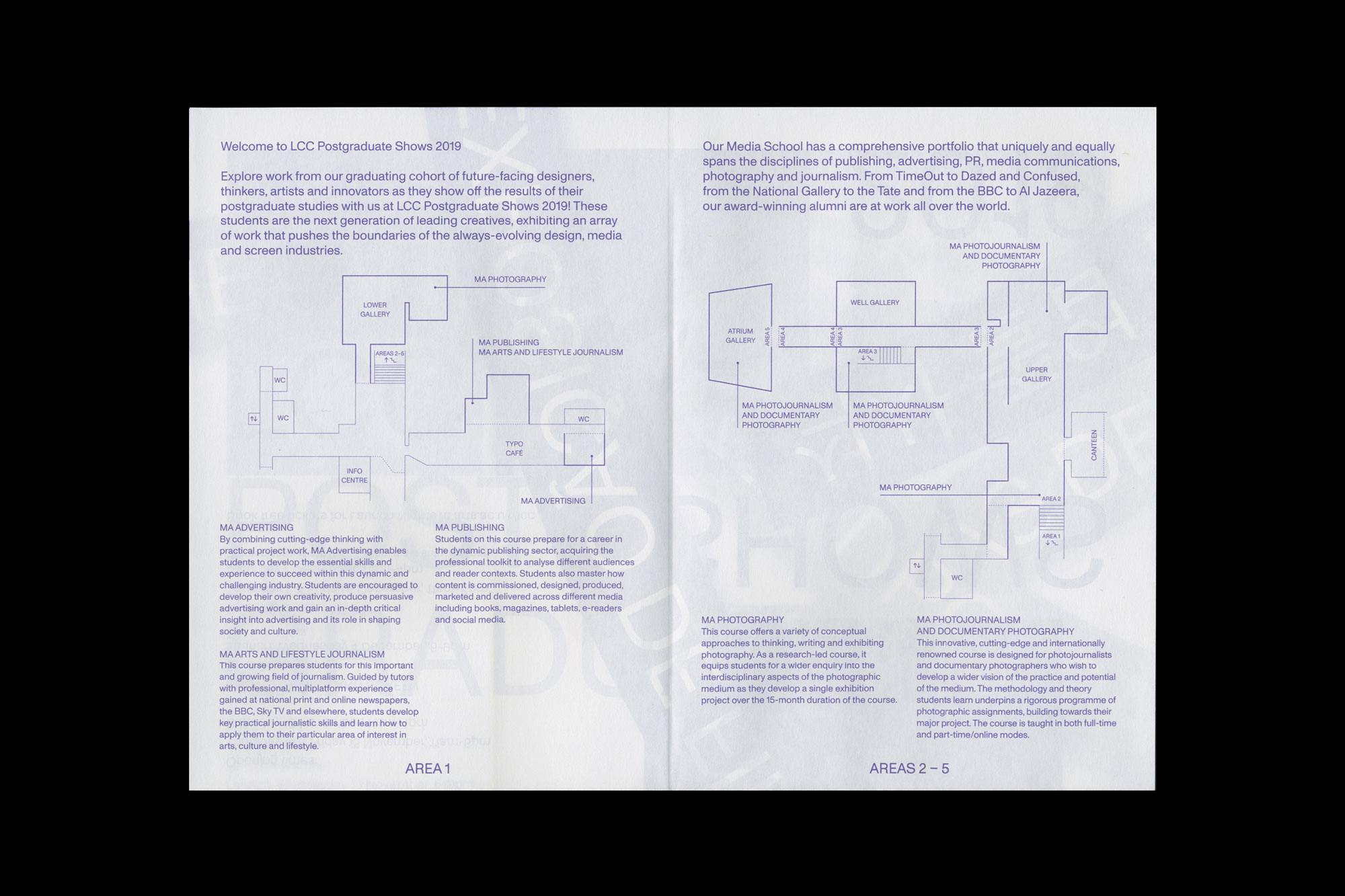
The showguides provided in the exhibition usually become a well-kept piece of ephemera for the students during the show. The main elements from the identity – language diversity, archiving, and disseminating – are present in the guides. Considering reducing the amount of print, each of the two shows included in the season has an independent poster-guide, adapting the size of the format to the size of the shows.
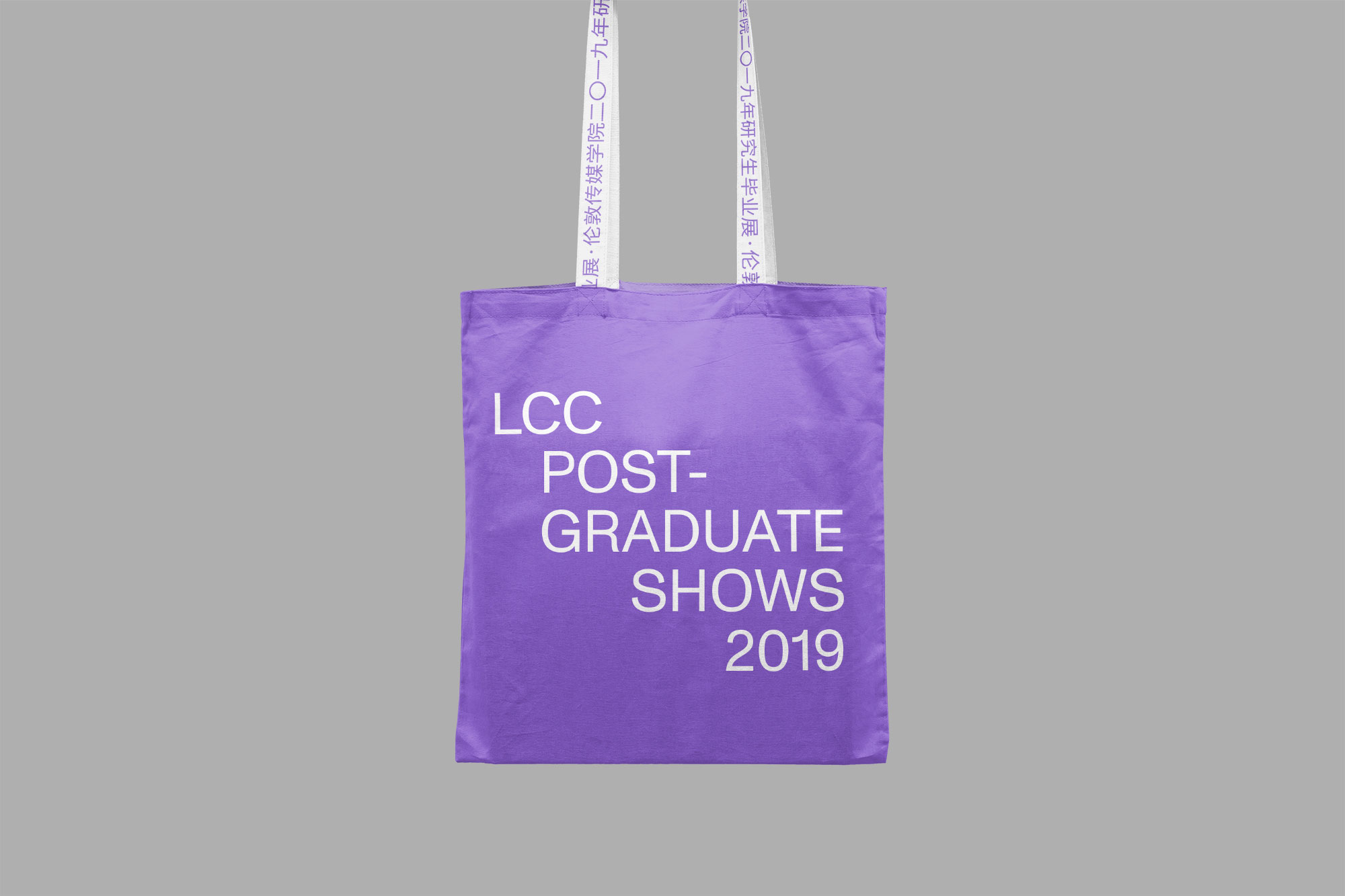
Other Works

test sliderProject type
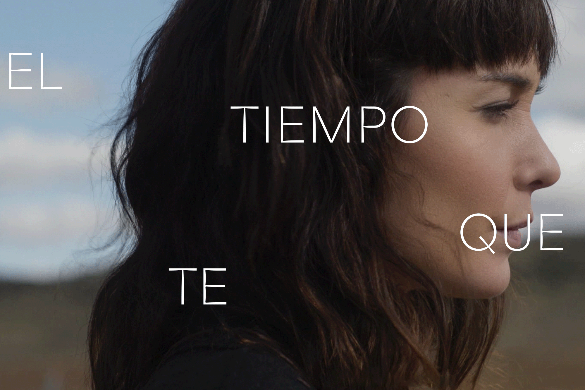
The Time it TakesMotion Graphics
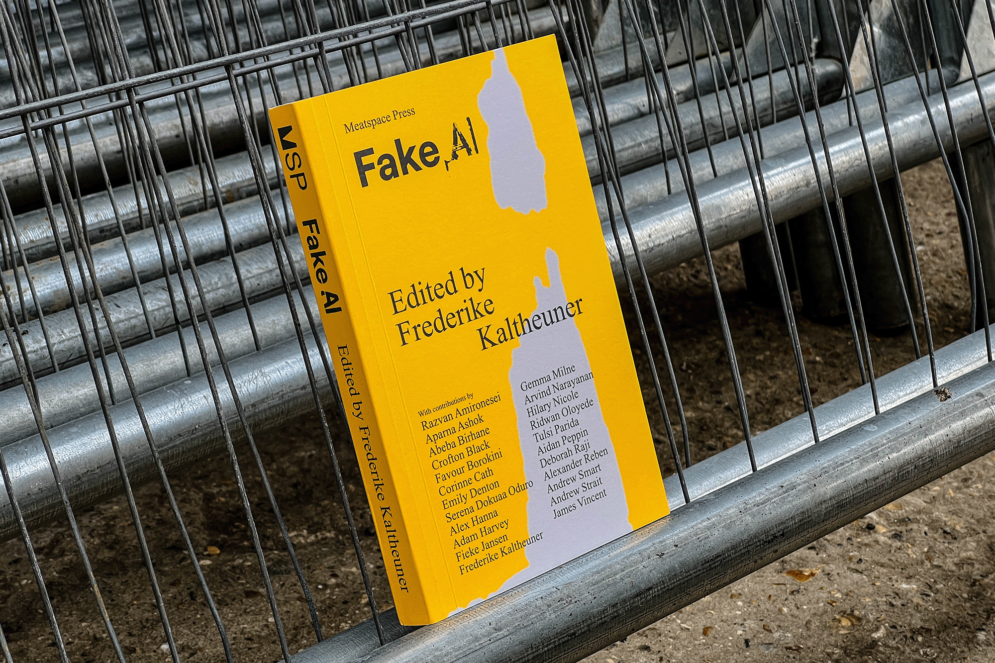
Fake AIEditorial
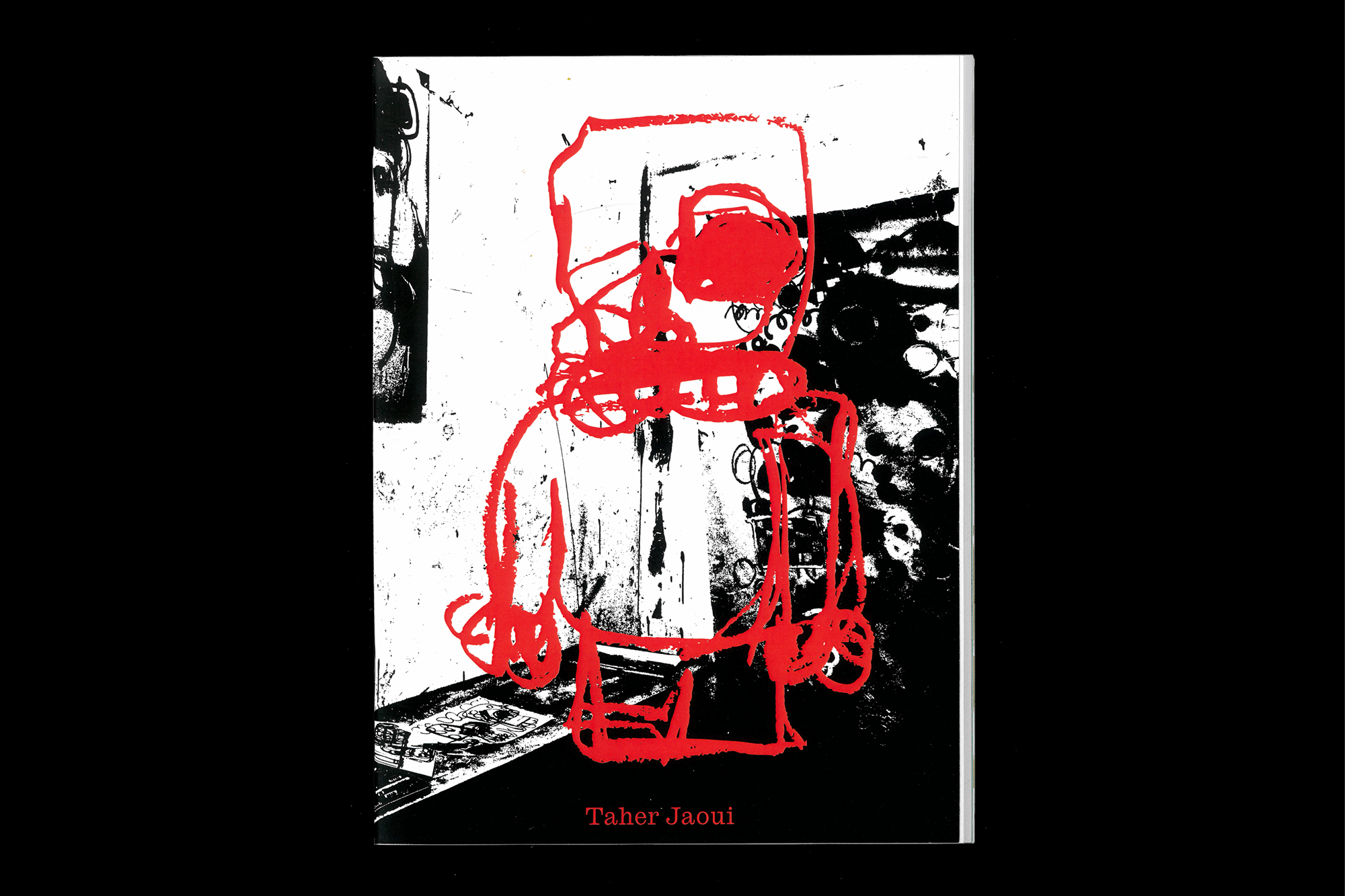
Taher Jaoui: Sketches 2022Artist Book
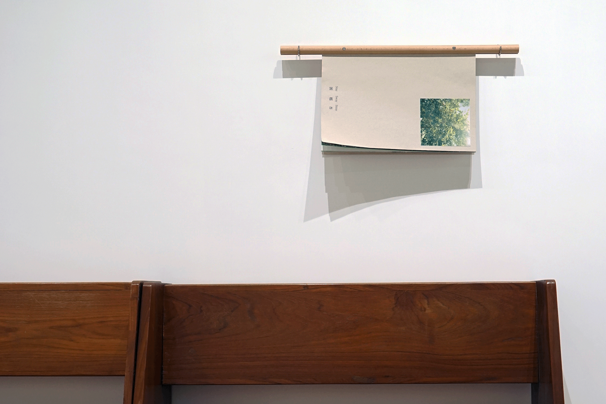
Stay/Sway/Stray (困榣杏)Artist Book
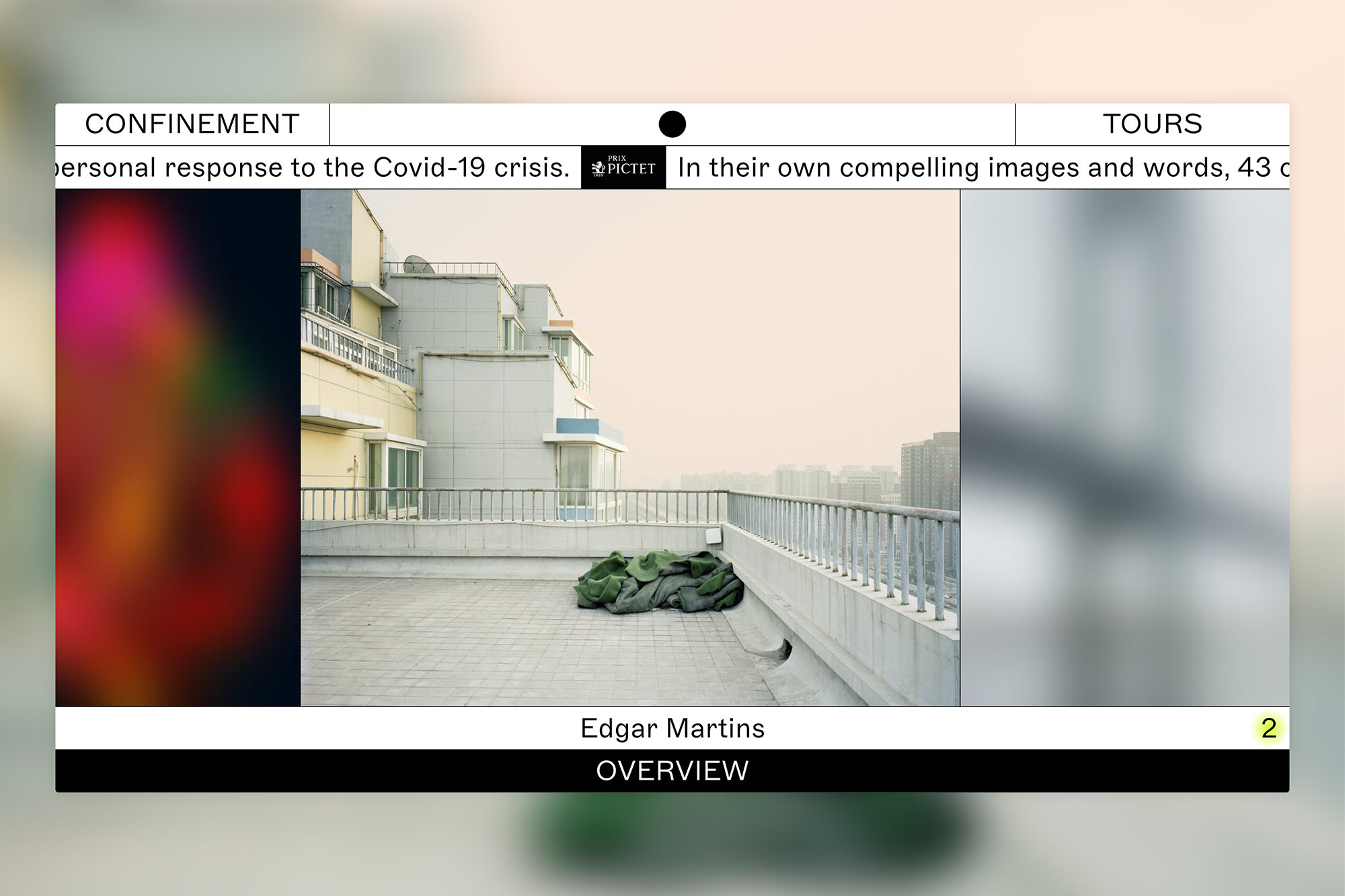
ConfinementExhibition
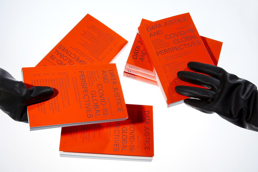
Data Justice and COVID-19Editorial
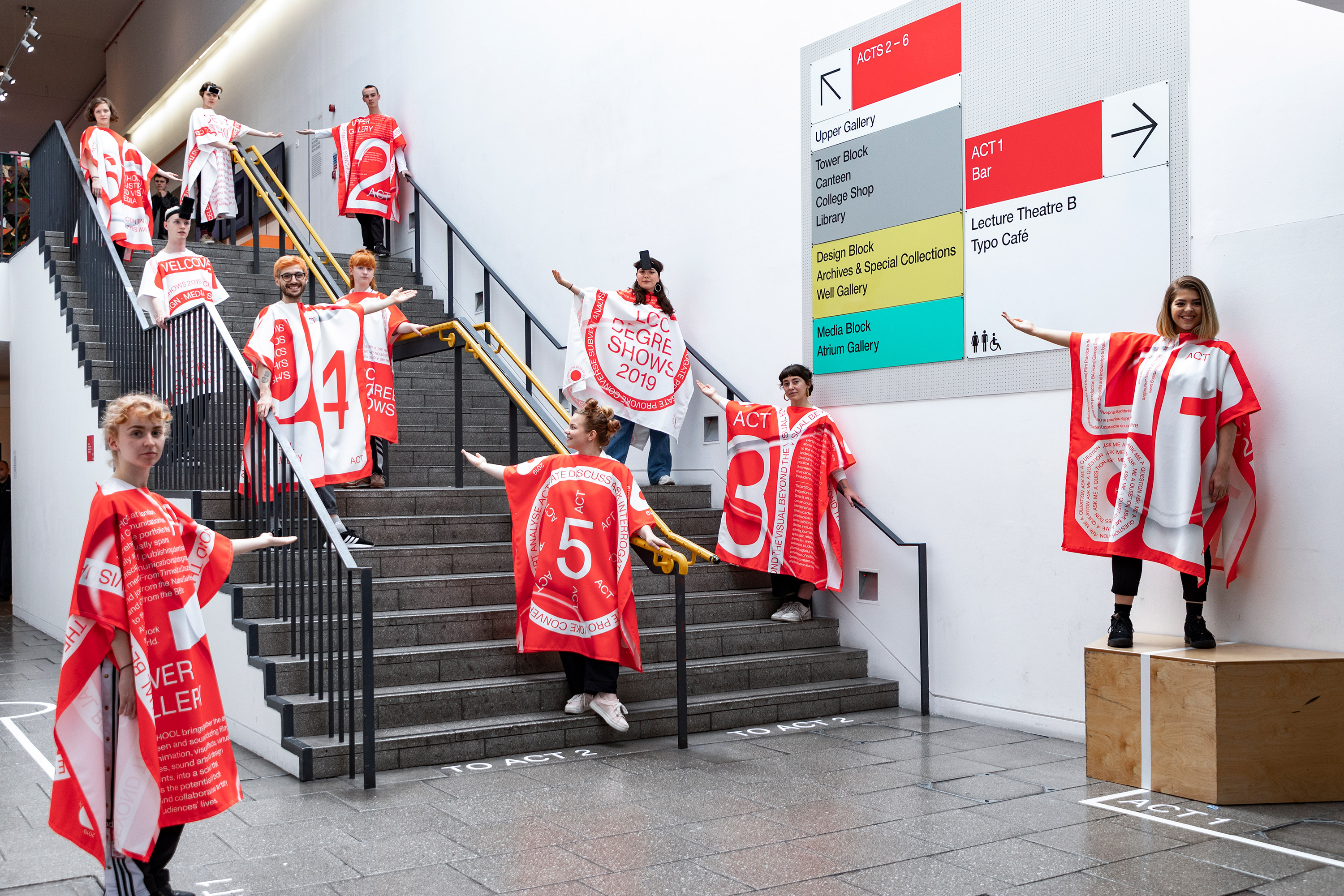
LCC Degree Shows 2019Exhibition
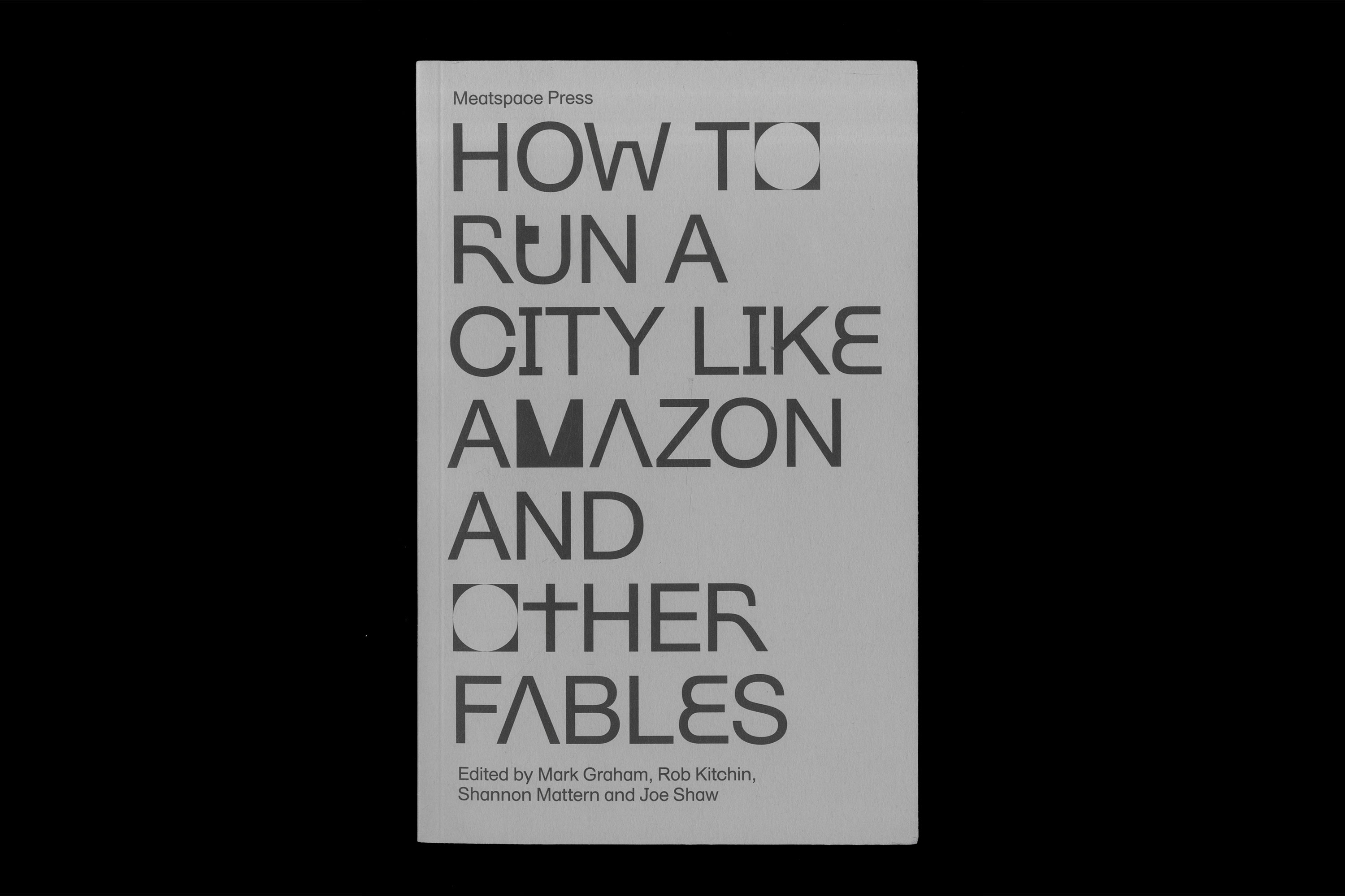
HTRCLAEditorial
LCC Postgraduate ShowsExhibition
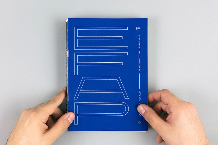
Expanding the Field of Architectural PublishingEditorial, Research
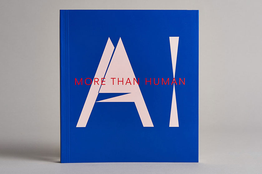
AI: More than HumanEditorial
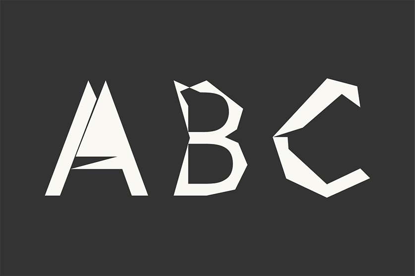
Digi Grotesk AIType
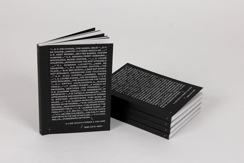
A Line which Forms a VolumeEditorial
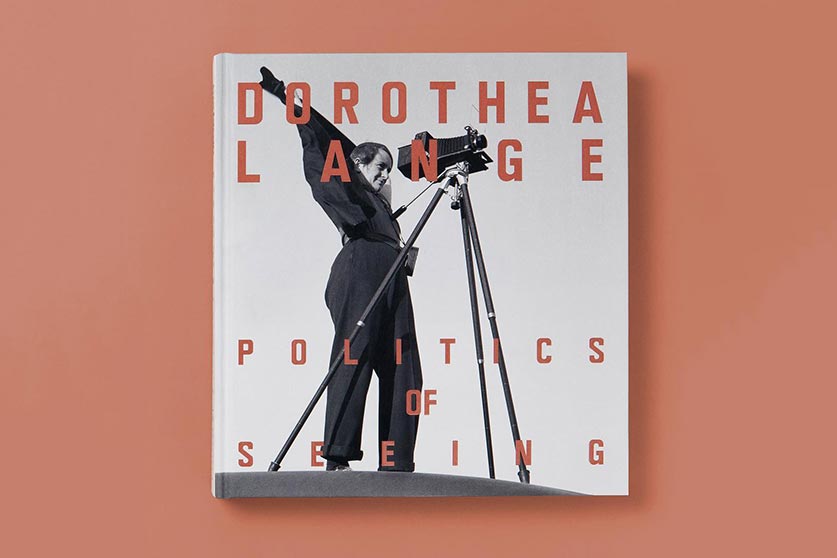
Dorothea Lange: Politics of SeeingEditorial, Exhibition
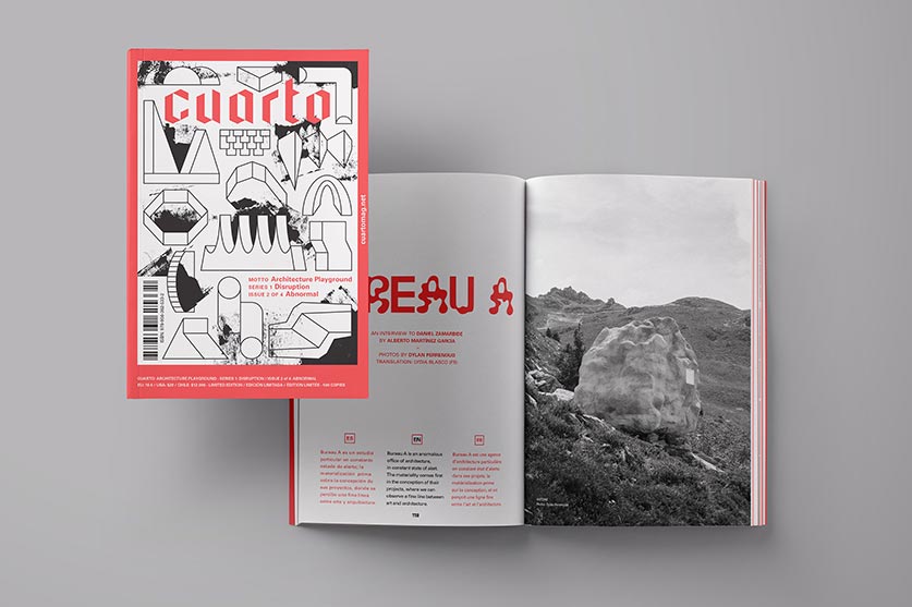
Cuarto: Architecture PlaygroundEditorial, Art Direction
CoversEditorial, Textile
Review of Incidental ArchitectureResearch, Editorial
HyperkoblingResearch, Digital Design
Album de ChileEditorial, Branding, Exhibition
MalamagArt Direction, Graphic Design
