Carlos Romo-Melgar
→ Works
→ → A Line Which Forms A Volume
CLIENT: MA GMD / LCC
ROLE: Graphic Designer
LOCATION: London
DATE: 2017
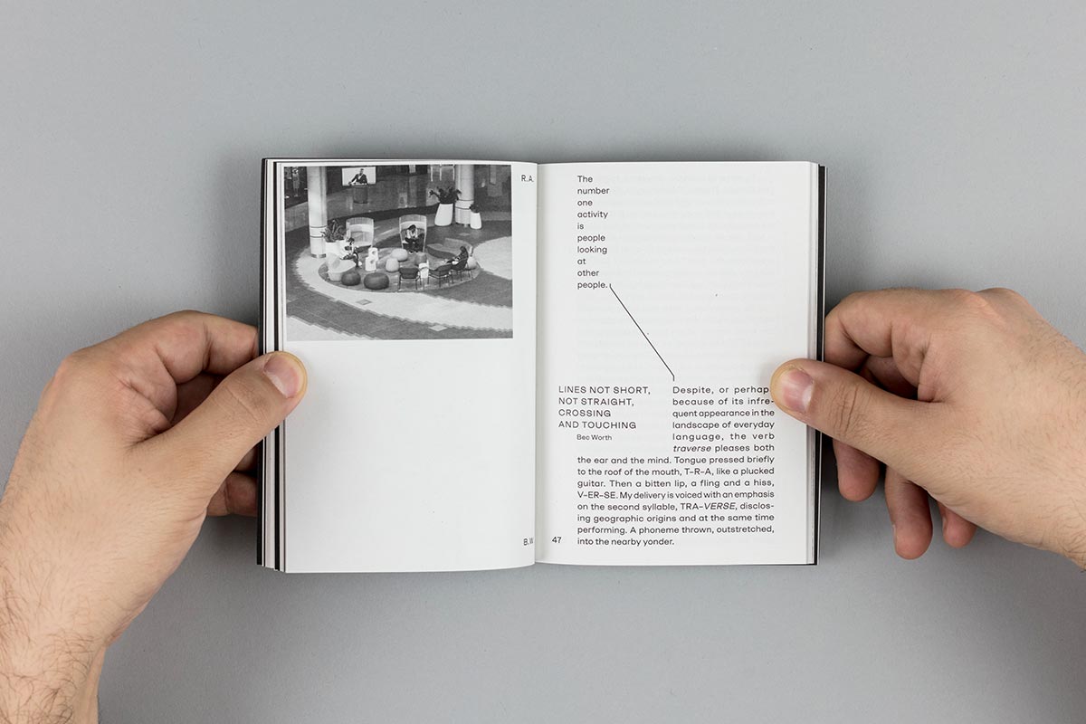
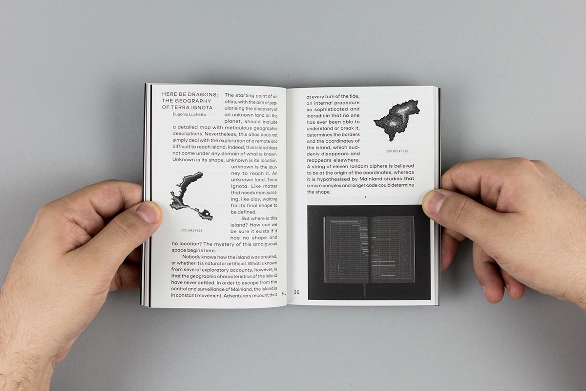
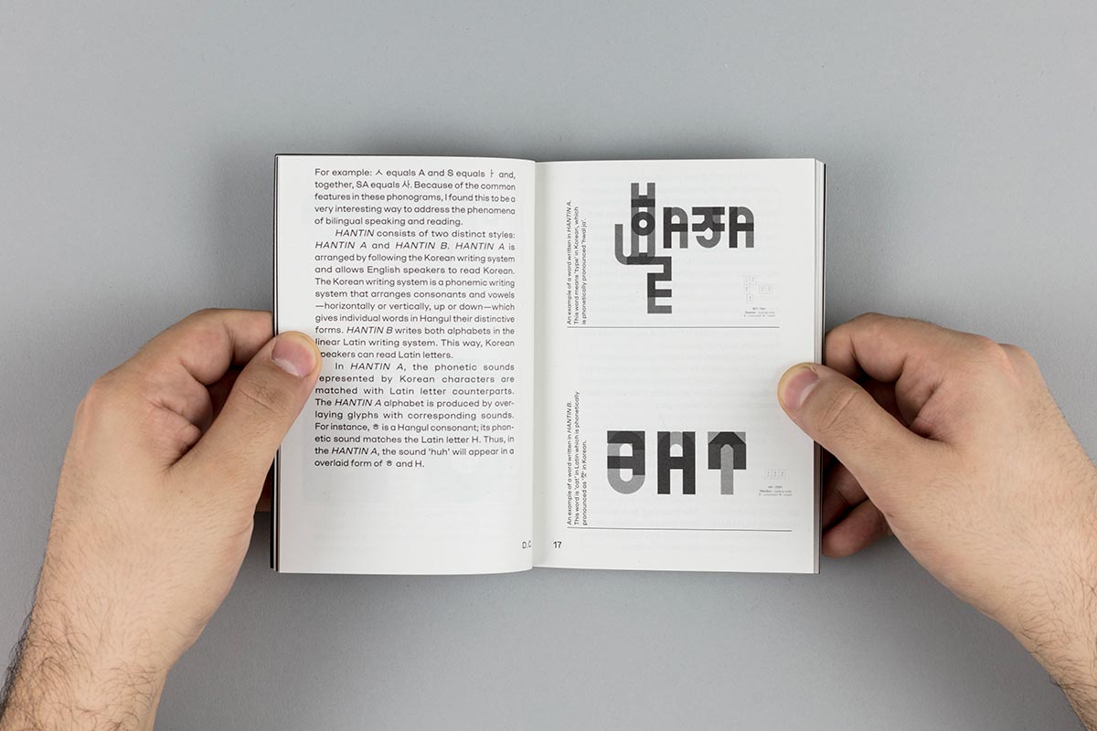
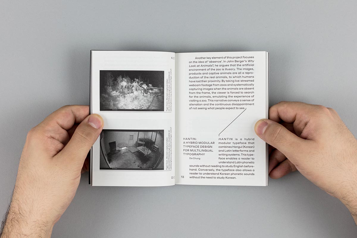
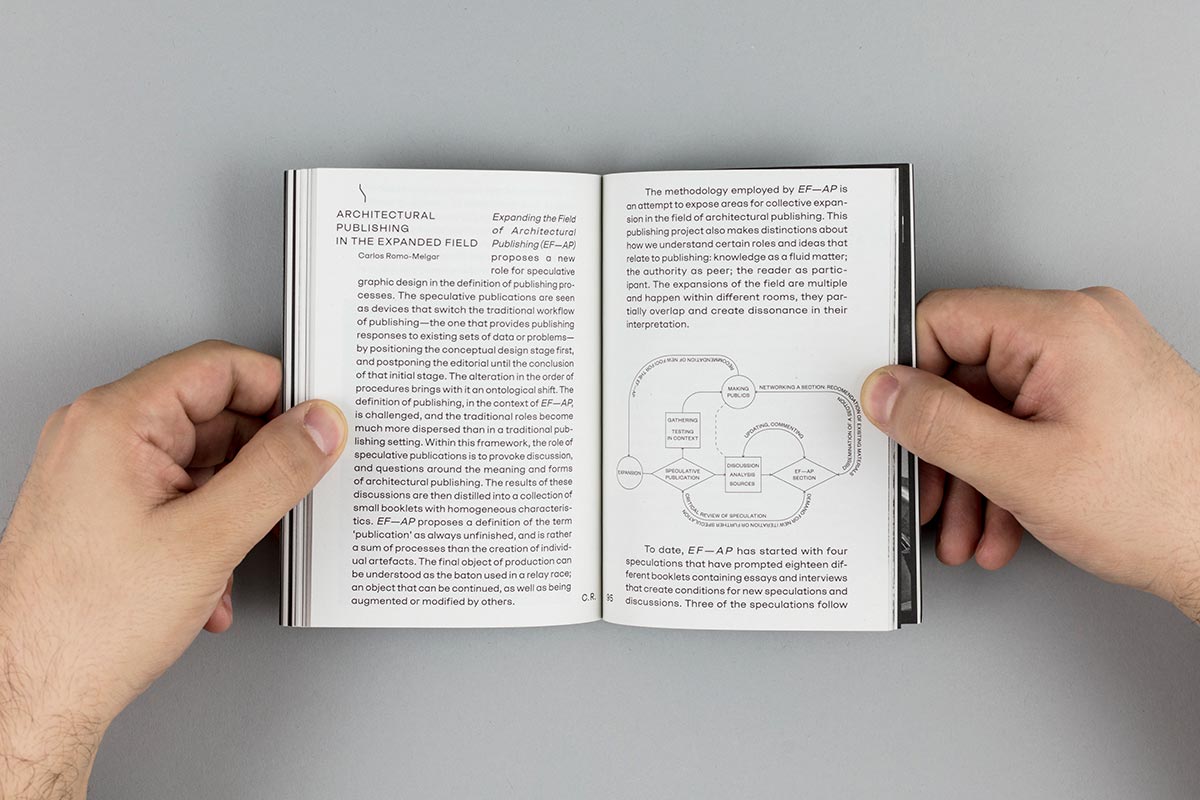
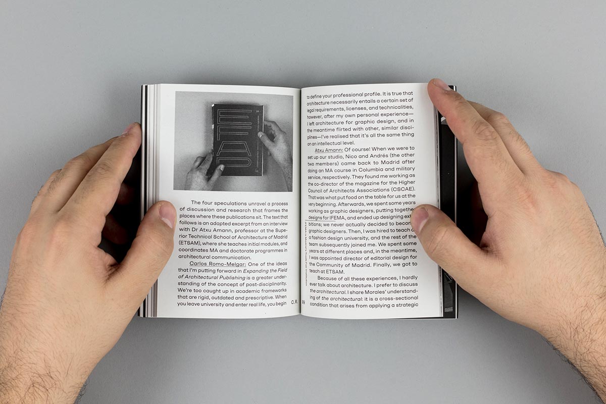
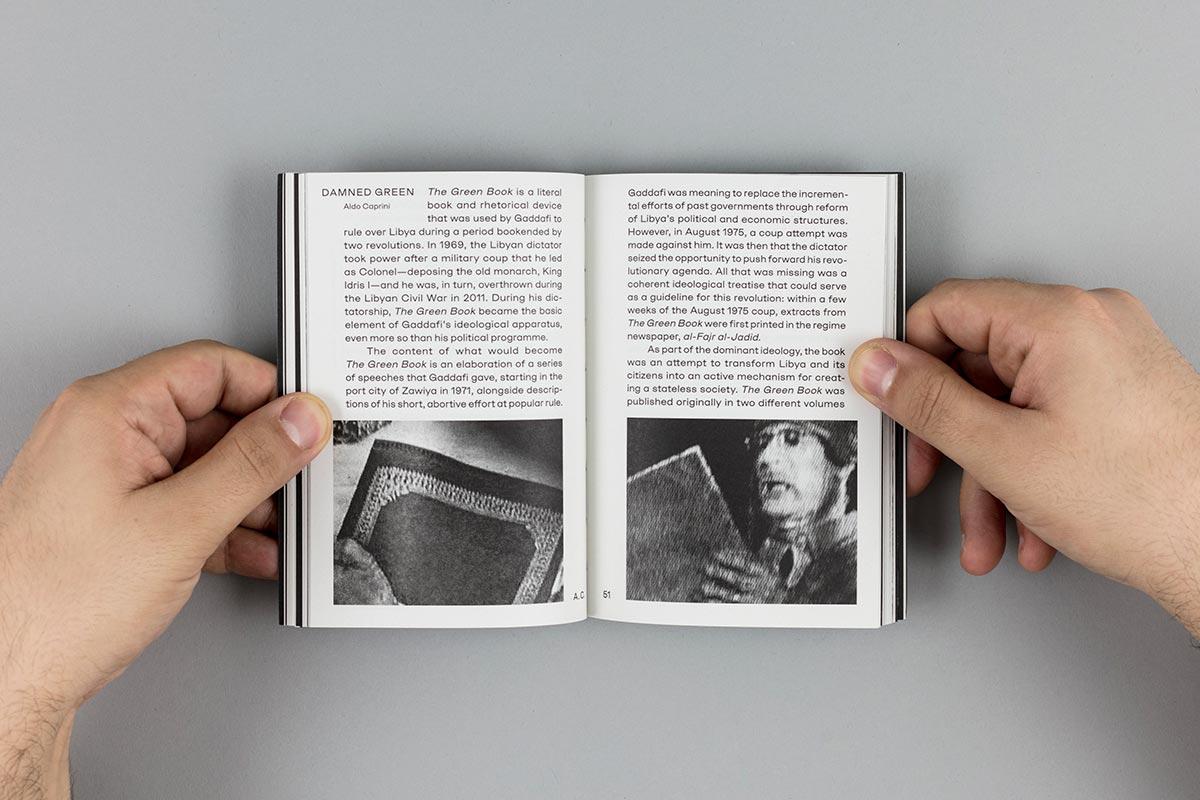
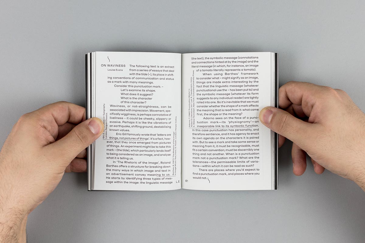
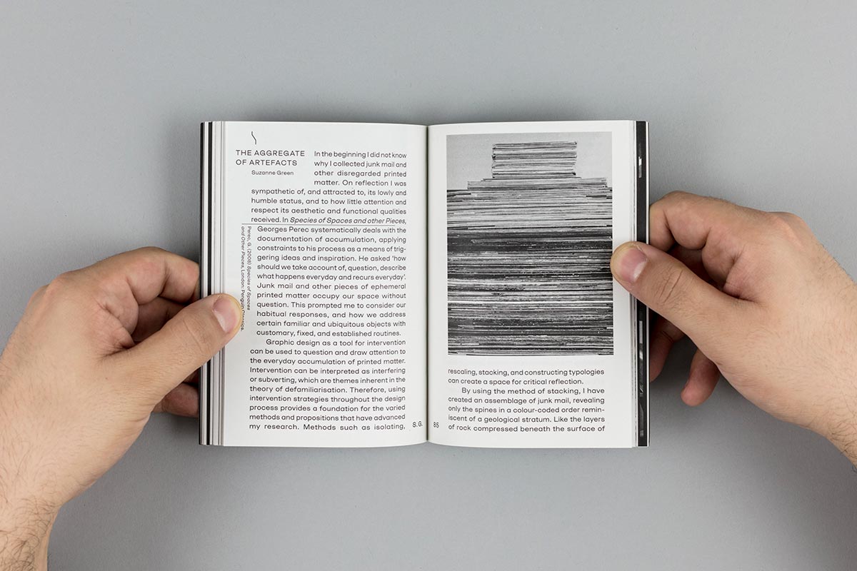
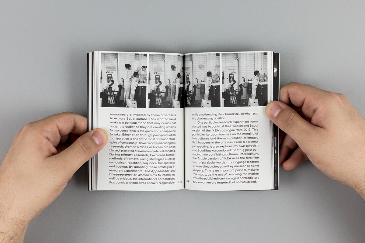
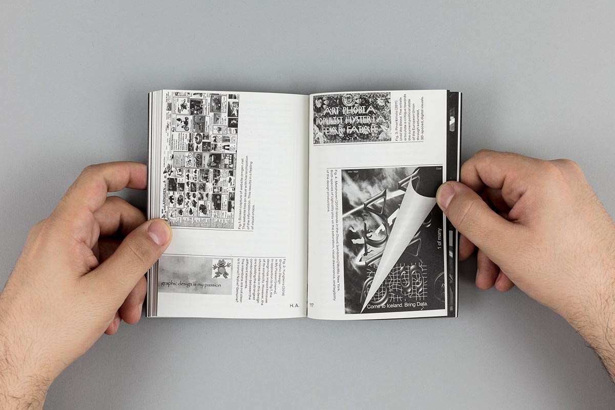
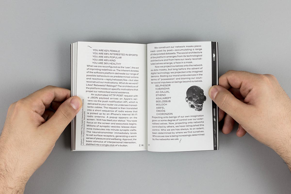
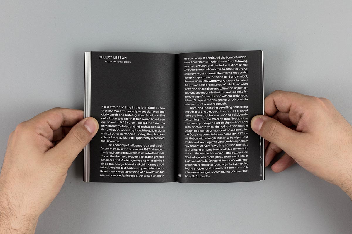
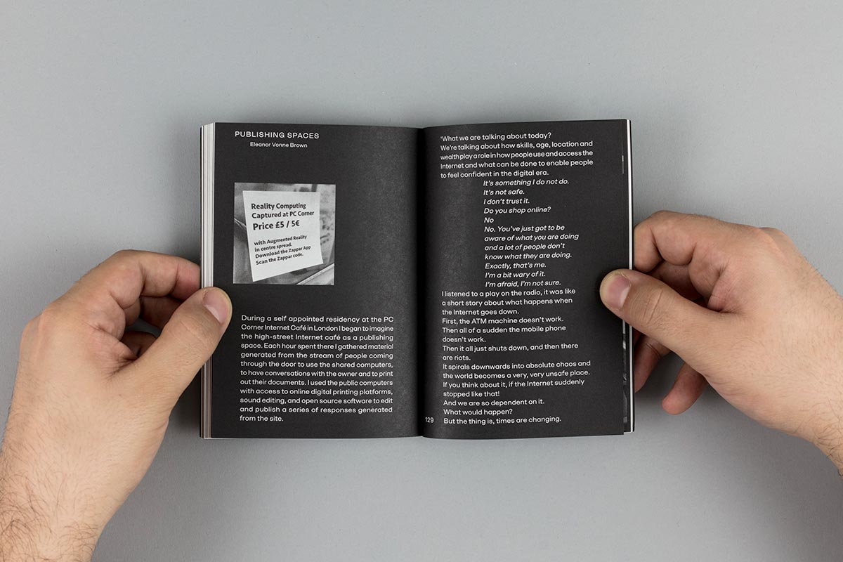
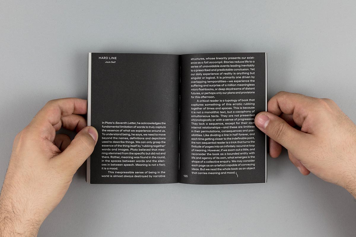
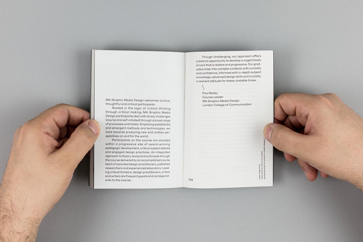
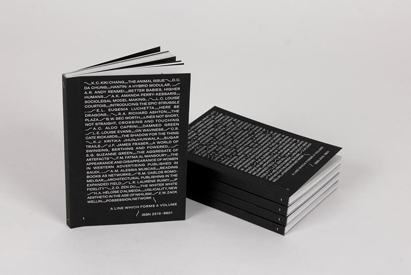
A Line Which Forms a Volume is a critical reader of graphic design-led research that is edited, written, designed and published by participants of the MA Graphic Media Design course at London College of Communication.
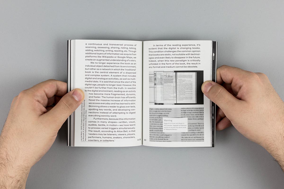
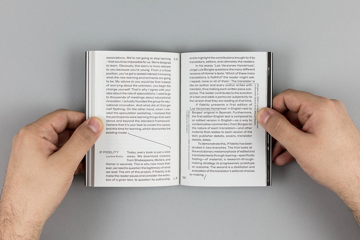
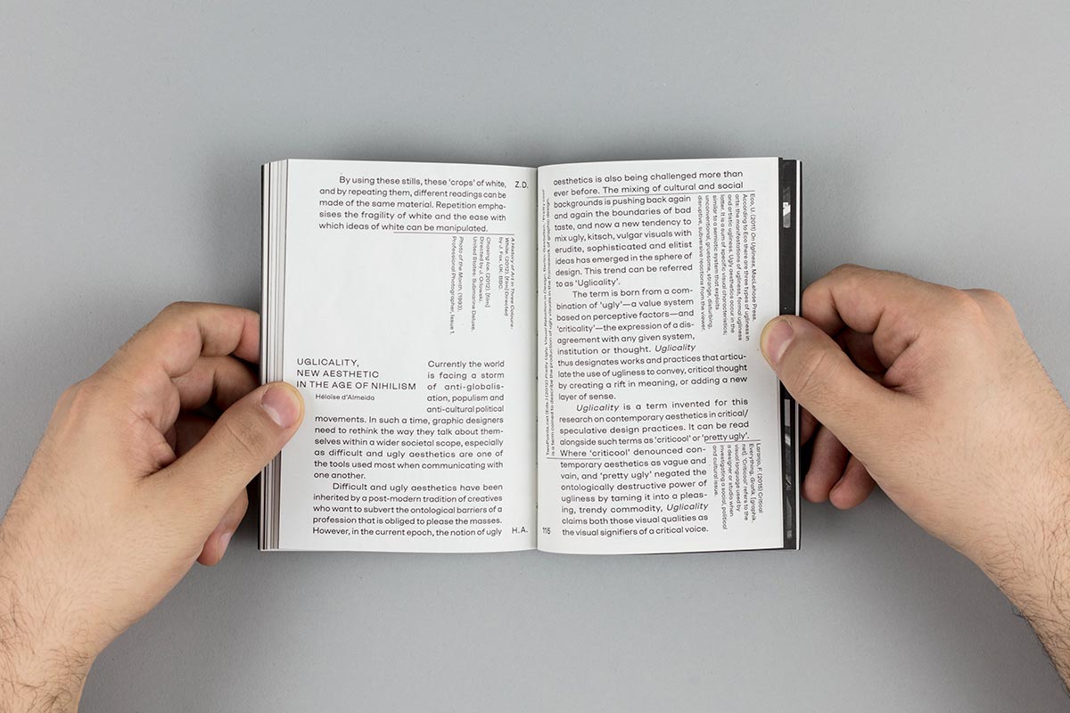
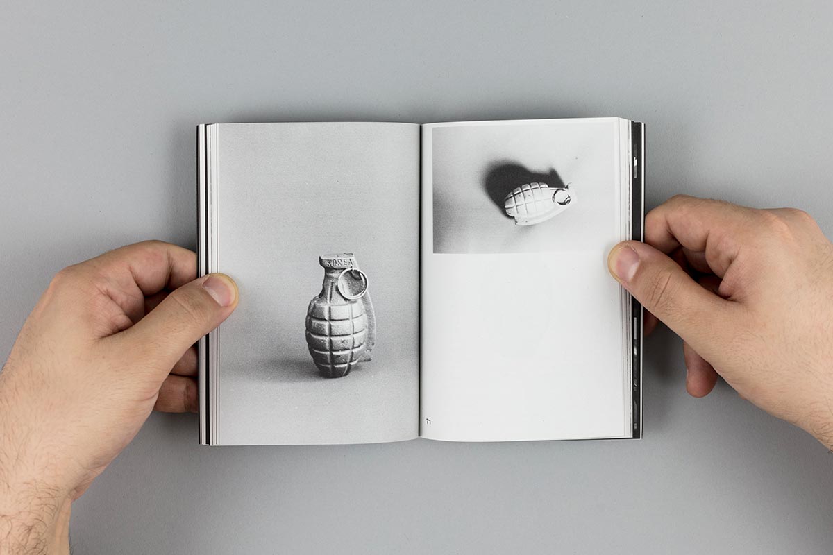
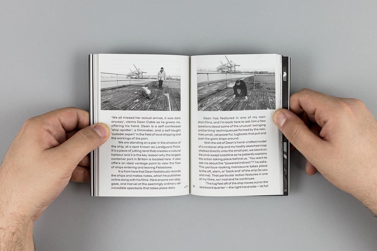
The publication creates a continuous flow of content from the very diverse contributions which aim to make public graphic design research. For this reason, it was prioritised the connections before authorship. In this mix, the editorial design constitutes an understated voice that gives space and aligns that content diversity into a linear narration.
UNDERSTATED AUTHORSHIP
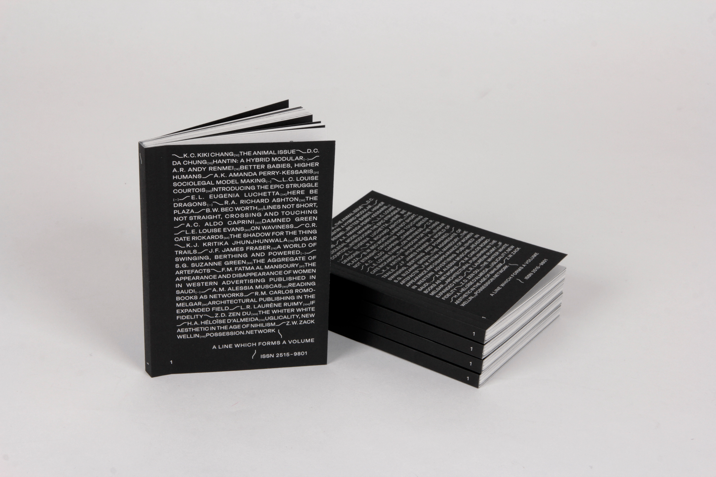
The unifying approach in the contents treatment facilitated a less-authoritative approach in the display of other elements such as the cover. Authorship was deemed as secondary regarding the importance of the editorial ‘line’. In this way, the cover reveals initials and titles of all the elements that form that line.
CONTINUOUS FLOW OF CONTENT
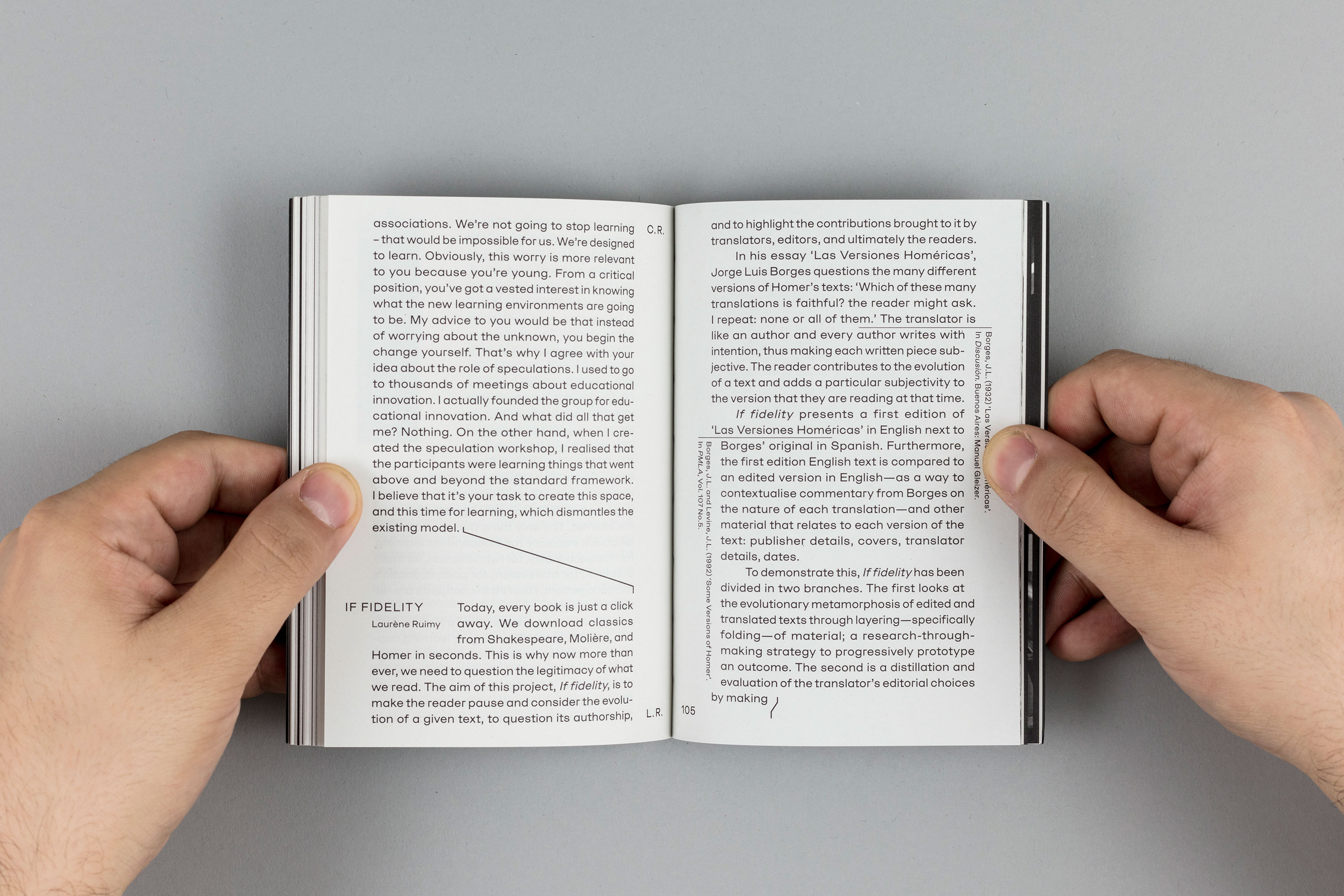
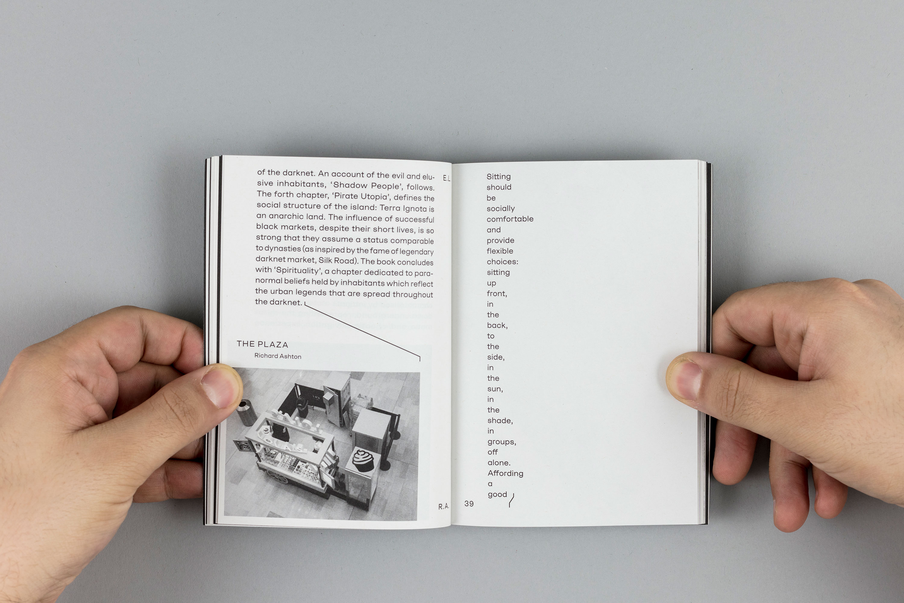
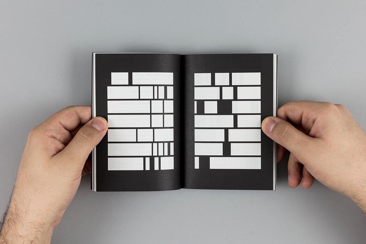
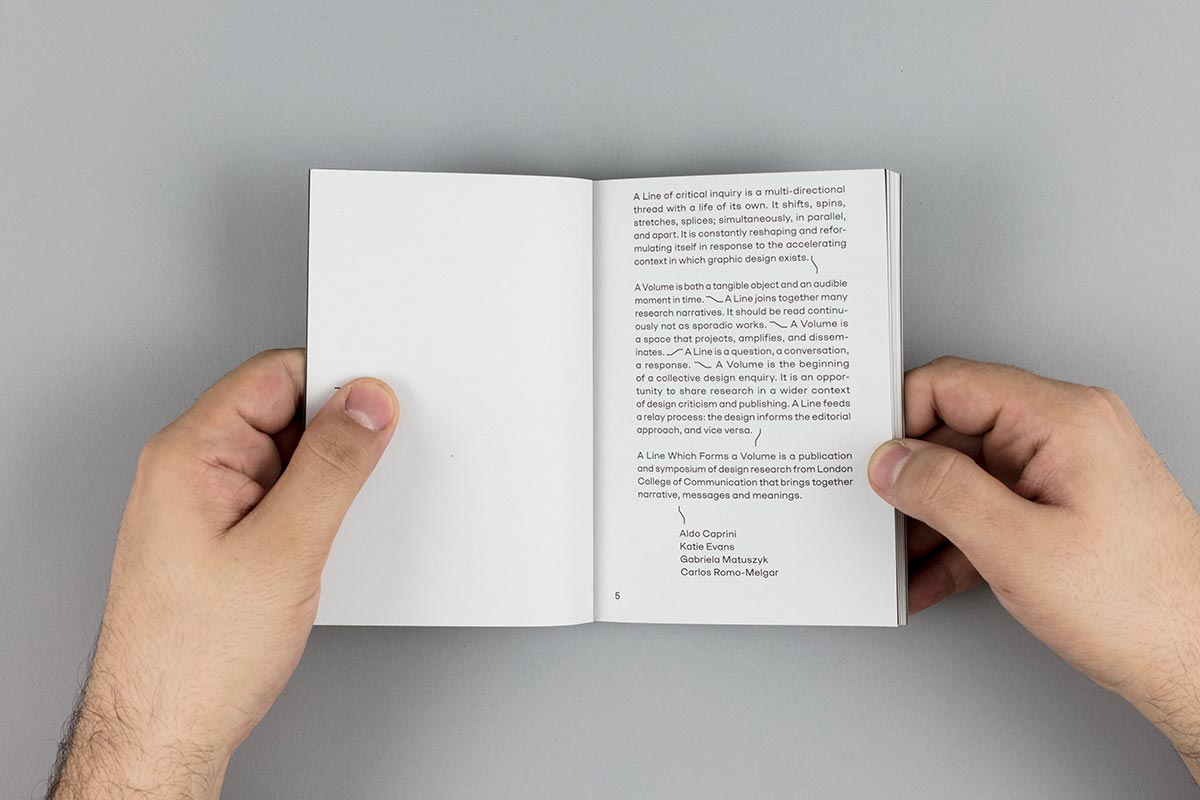
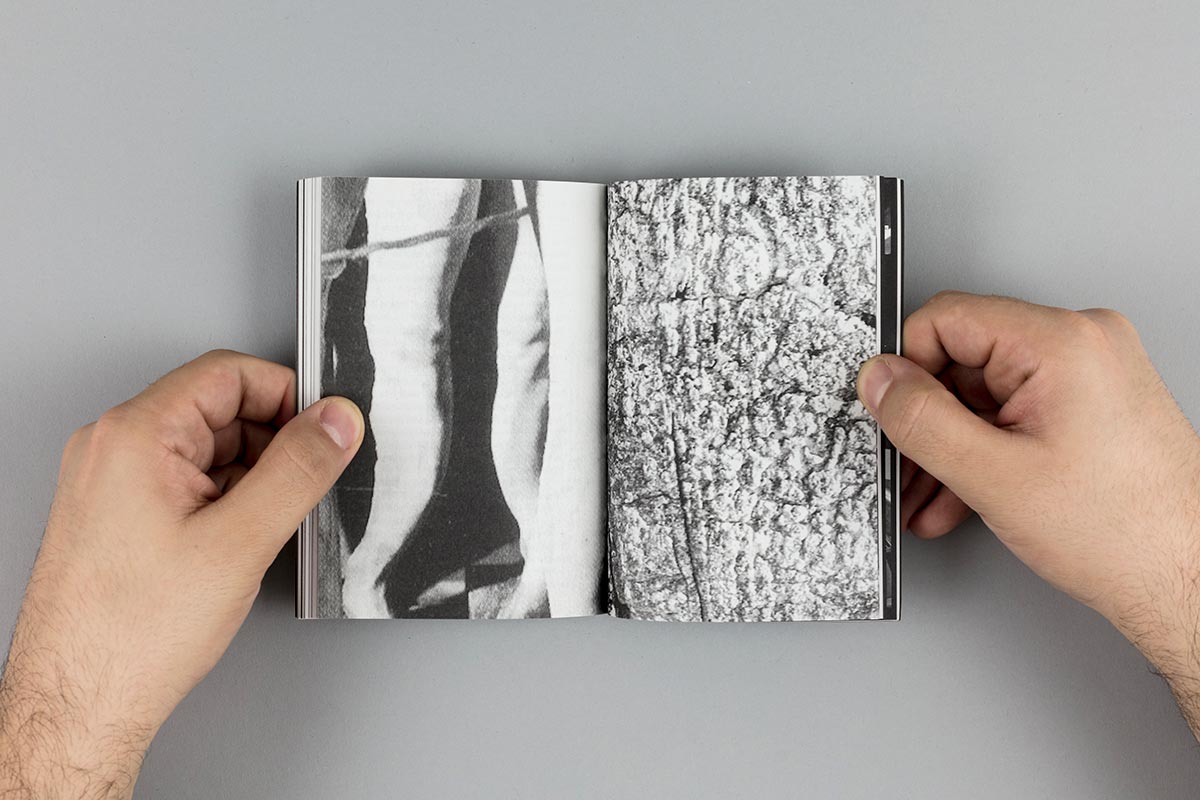
The editorial continuous flow of content was facilitated by the idea of ‘splicing’, a technique used in analogic filmmaking to join two parts of separate footage. In the publication, the breaks between each individual contribution are softened and the blurry limits are just signified by a glyph that was made for this purpose.
Other Works

test sliderProject type
The Time it TakesMotion Graphics
Fake AIEditorial
Taher Jaoui: Sketches 2022Artist Book
Stay/Sway/Stray (困榣杏)Artist Book
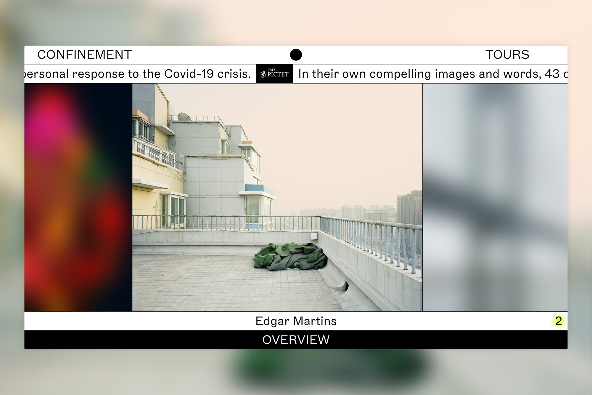
ConfinementExhibition
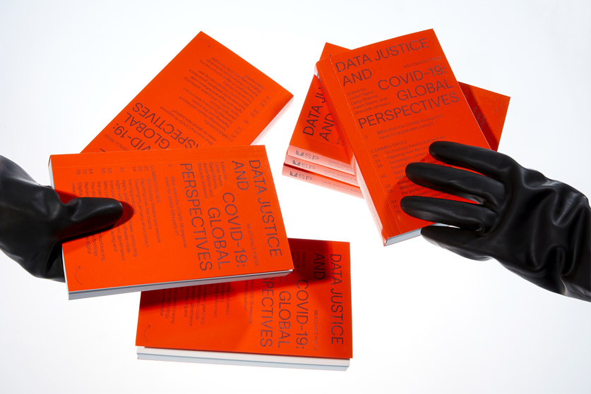
Data Justice and COVID-19Editorial
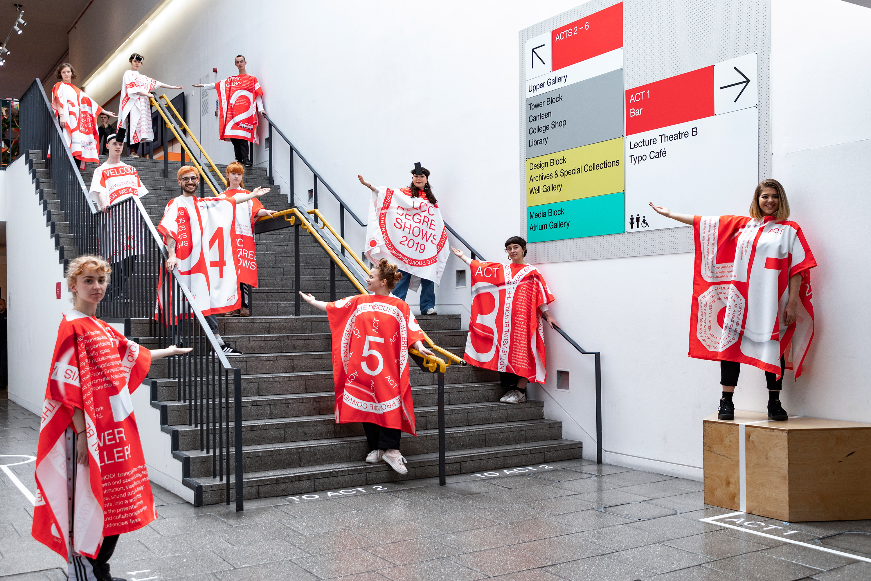
LCC Degree Shows 2019Exhibition
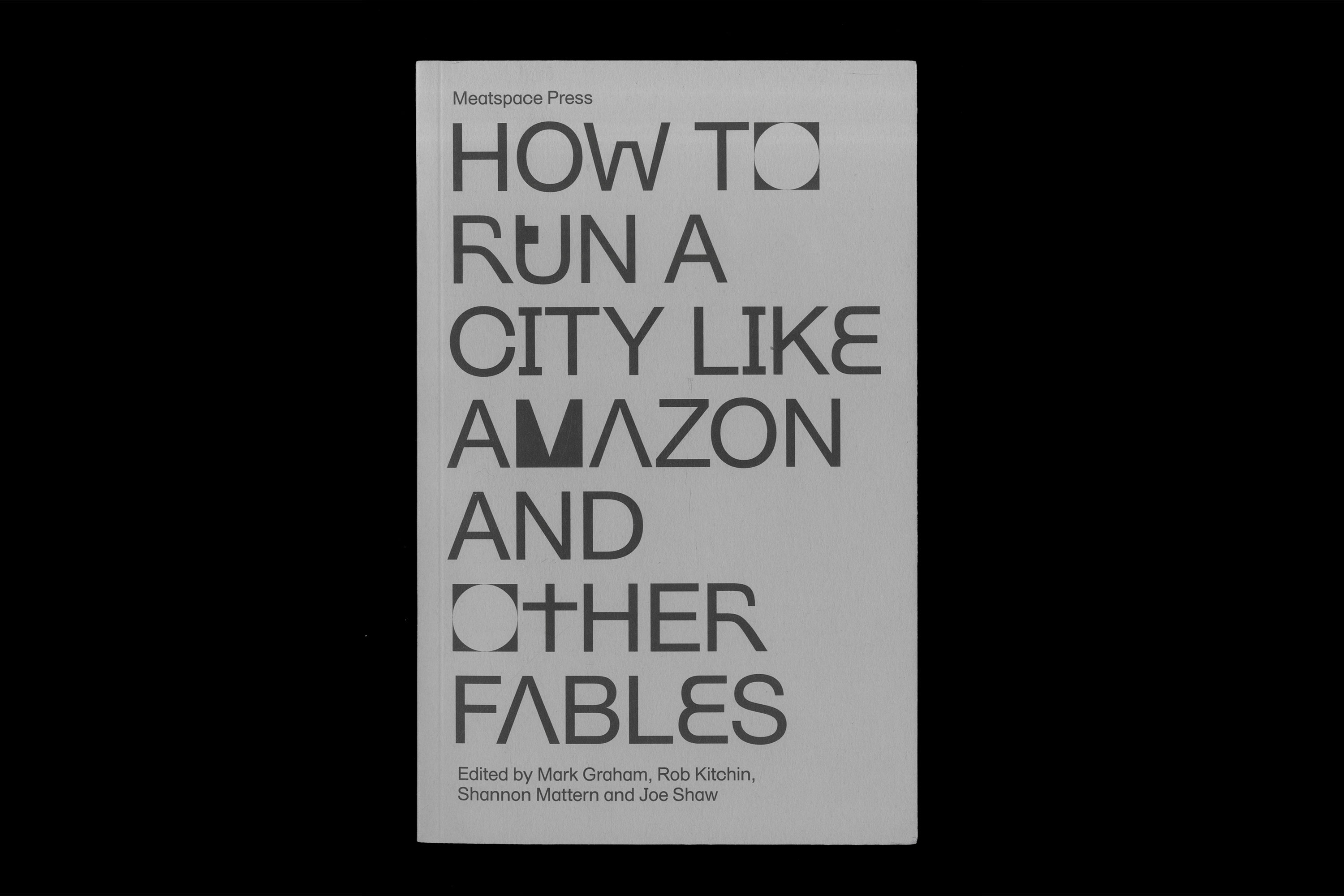
HTRCLAEditorial
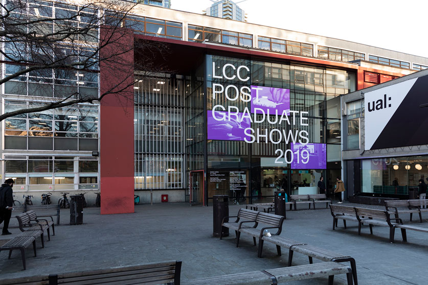
LCC Postgraduate ShowsExhibition
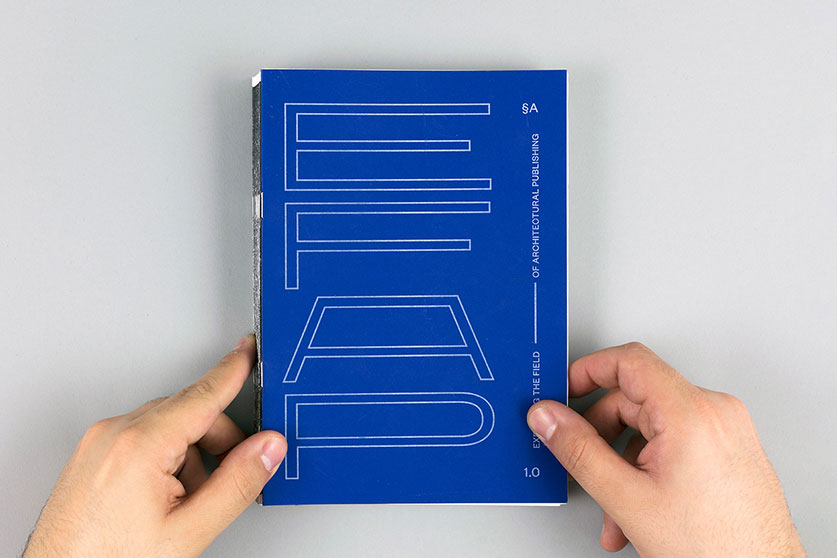
Expanding the Field of Architectural PublishingEditorial, Research
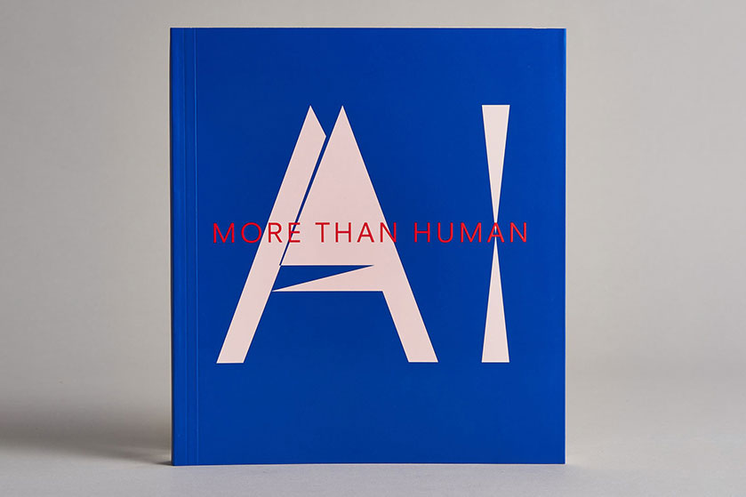
AI: More than HumanEditorial
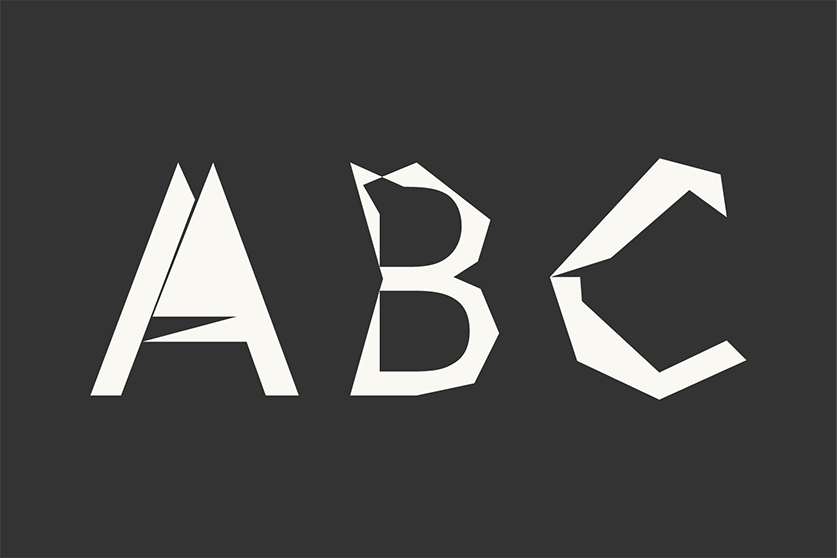
Digi Grotesk AIType
A Line which Forms a VolumeEditorial
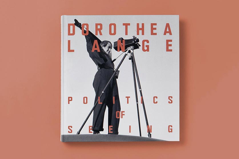
Dorothea Lange: Politics of SeeingEditorial, Exhibition
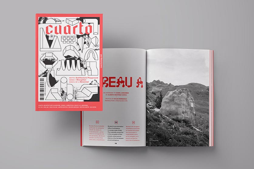
Cuarto: Architecture PlaygroundEditorial, Art Direction
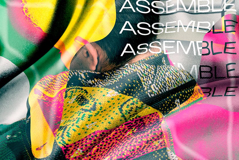
CoversEditorial, Textile
Review of Incidental ArchitectureResearch, Editorial
HyperkoblingResearch, Digital Design
Album de ChileEditorial, Branding, Exhibition
MalamagArt Direction, Graphic Design
